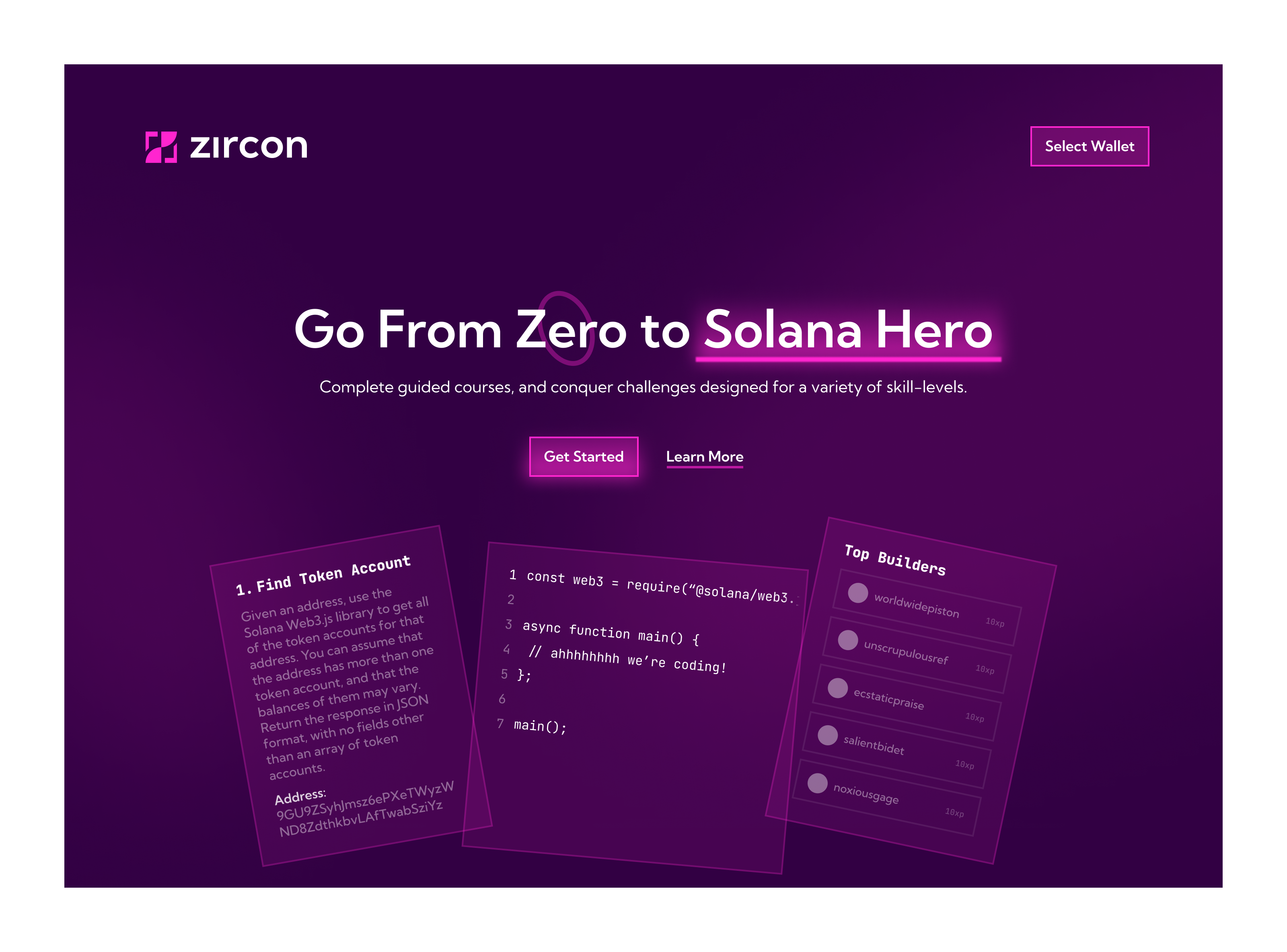
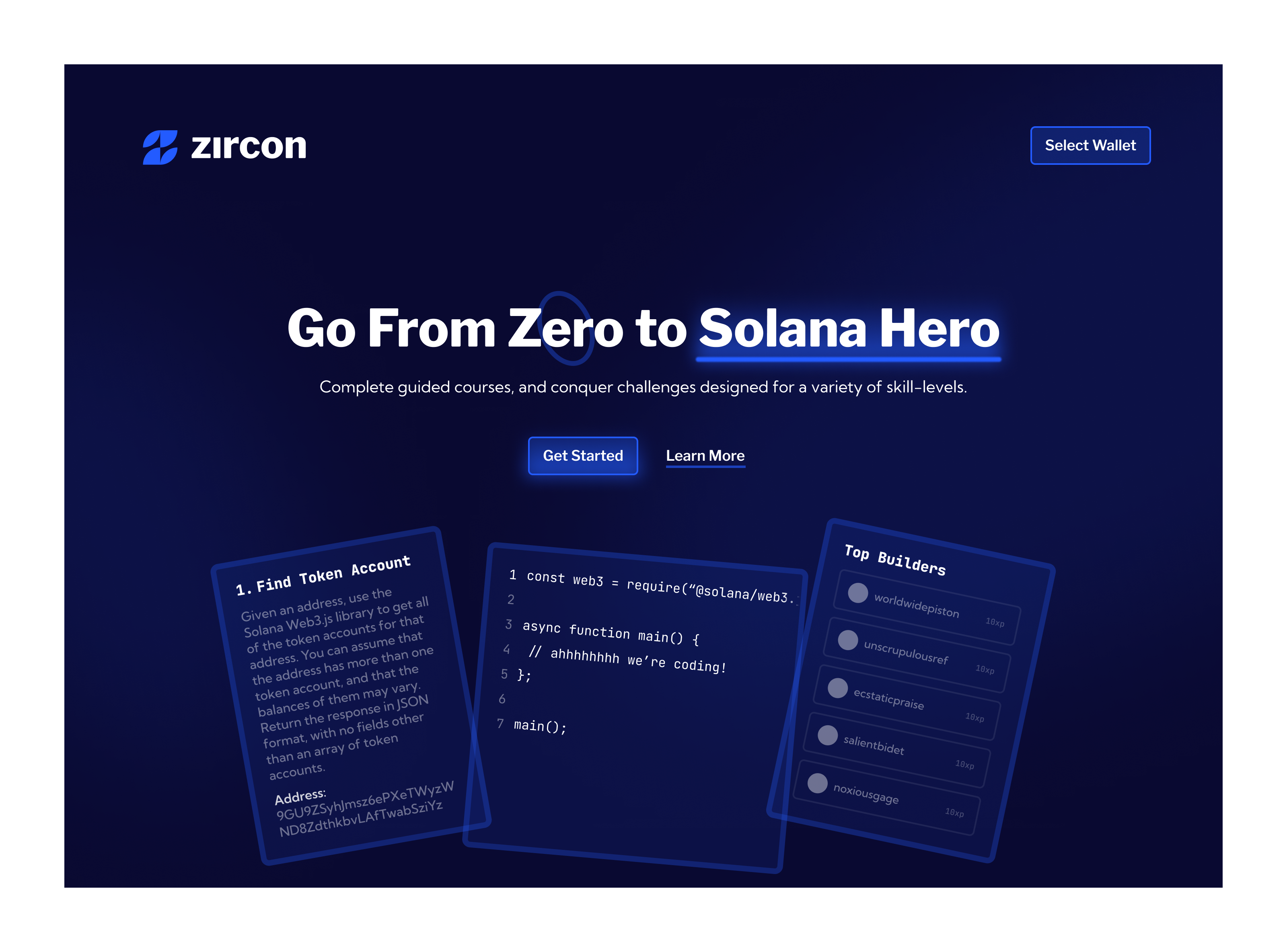
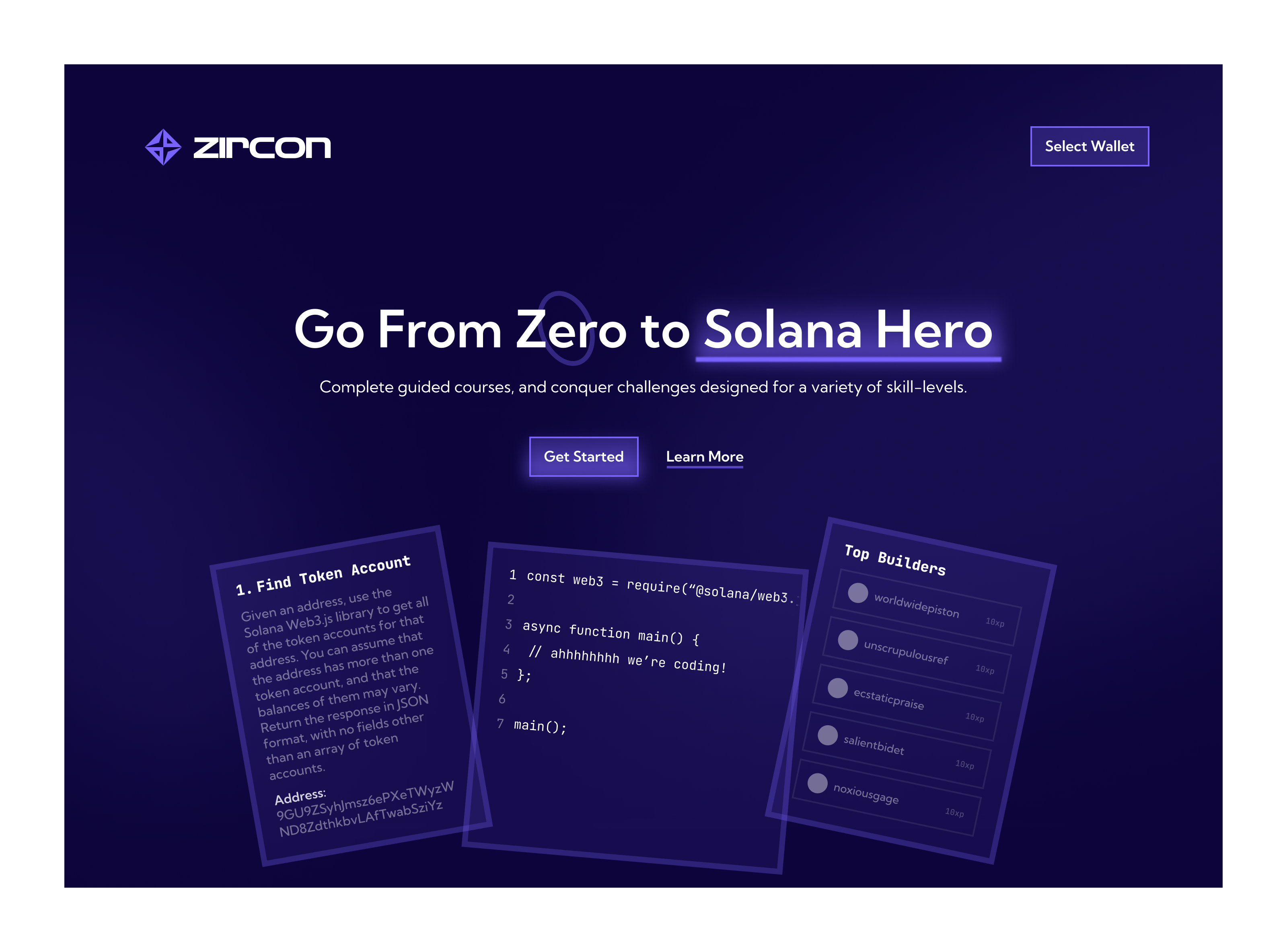
The Zircon learning platform has three core sections: Challenges, Learn, and Sandbox. I was tasked to design each with my own interpretation of the identity and company, as this is a recently funded startup with great room for exploration.
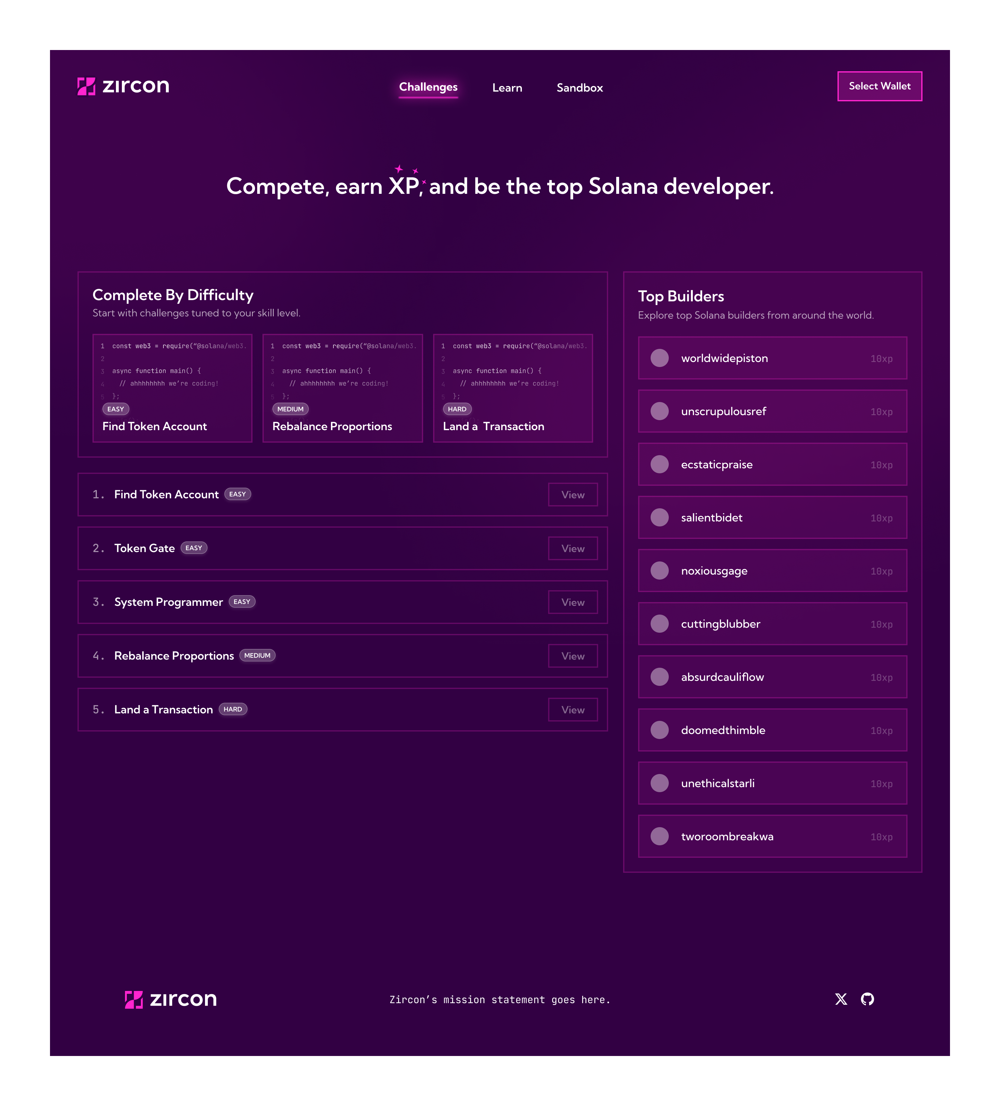
First, the Challenges view. The founder had a clear idea of the type of content they wanted to display here. I took their ideas and wrapped them into the brand we just crafted, presenting the page above. An aspect of the Challenges view I particularly like is the Top Builders section. As people join Zircon and begin learning, they will begin to accumulate XP. The side panel on the right highlights the top ten. I think it adds a fun competitive edge to learning and could be expanded in a variety of ways in the future.
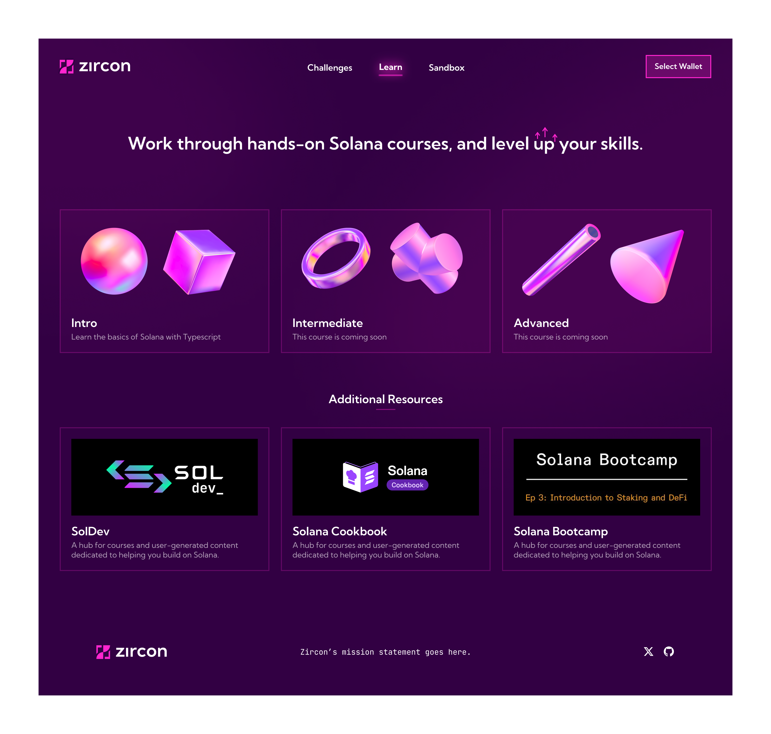
Second is the Learn view, where all the educational content can be found. The content here is broken up by difficulty, with abstract shapes as placeholder items until the founder decides how they want to present the course content. Below the three course tenets are additional resources published by Solana that students can access.
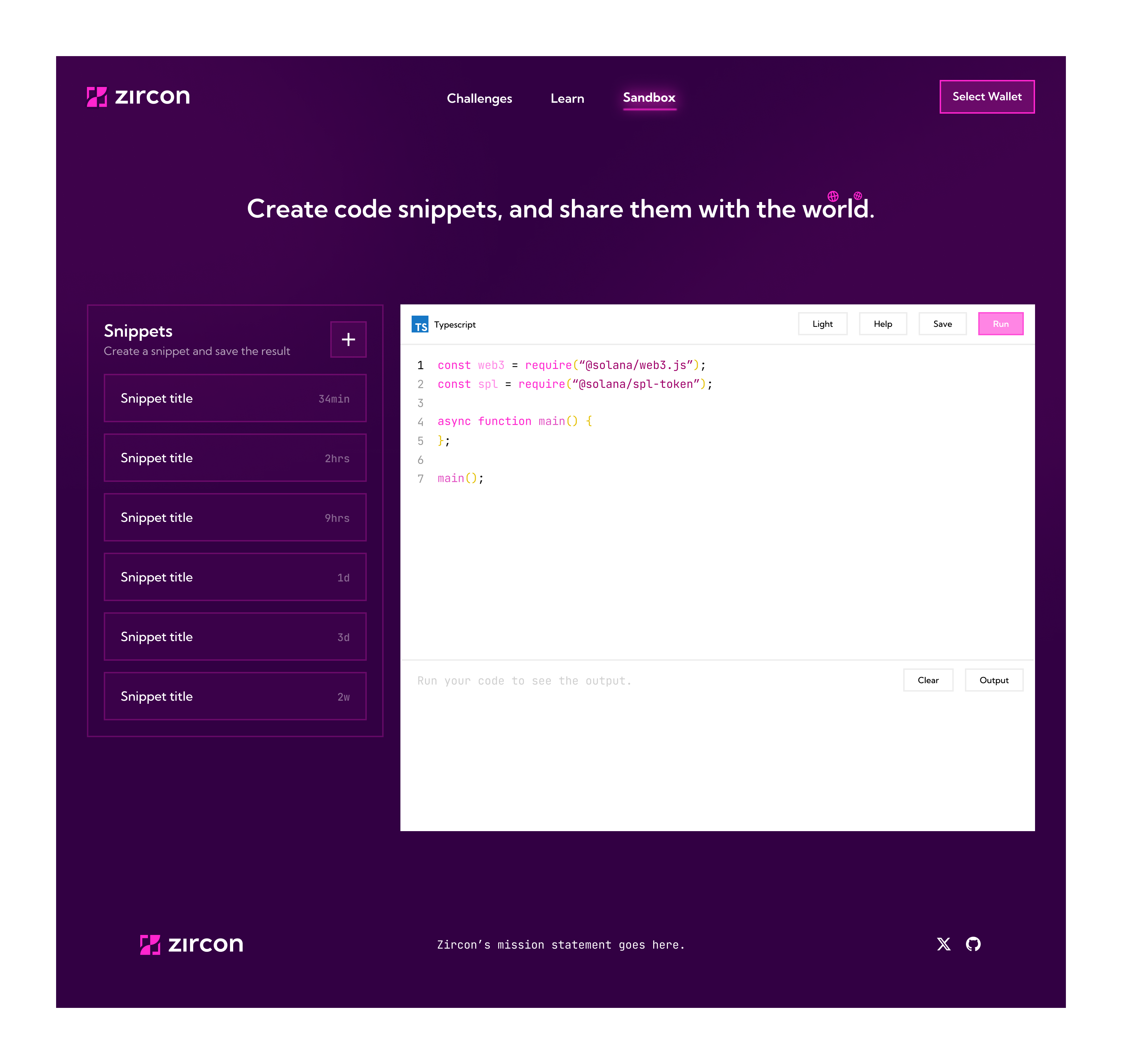
Lastly, the Sandbox is a space for learners to explore the programming knowledge they have been pursuing and try different ideas directly in their browser through the integrated IDE. They can save their code as "Snippets" and come back to them later. I could see a future scenario where learners can publish their Snippets to the community and gain feedback not only on their code but contribute to others' too.
A primary pillar for me, throughout this project, was cohesion among every aspect of the Zircon experience. I believe, as you use and interact with Zircon, whether through social media or their platform, it should feel like an extension of one another. Nothing abrupt. I believe we accomplished this here, and I look forward to seeing the many people who will benefit from Zircon's learning initiatives.
If you would like to discuss this project or anything else, don't hesitate to reach out.
